UX . UI
maveze?!
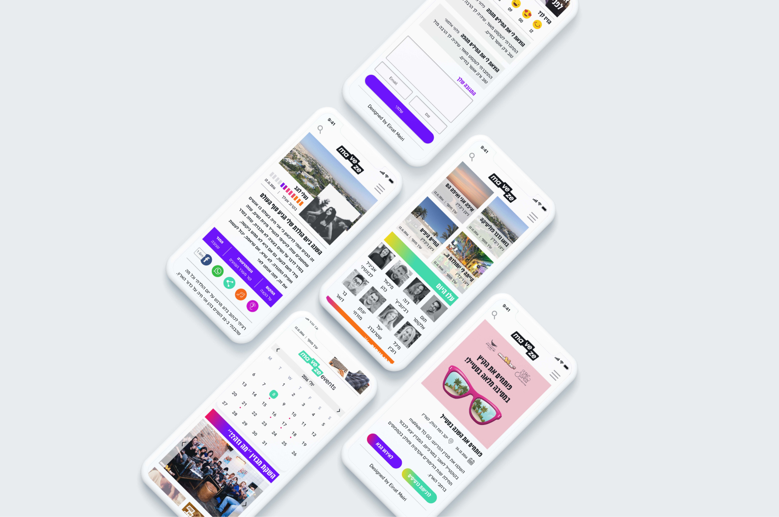
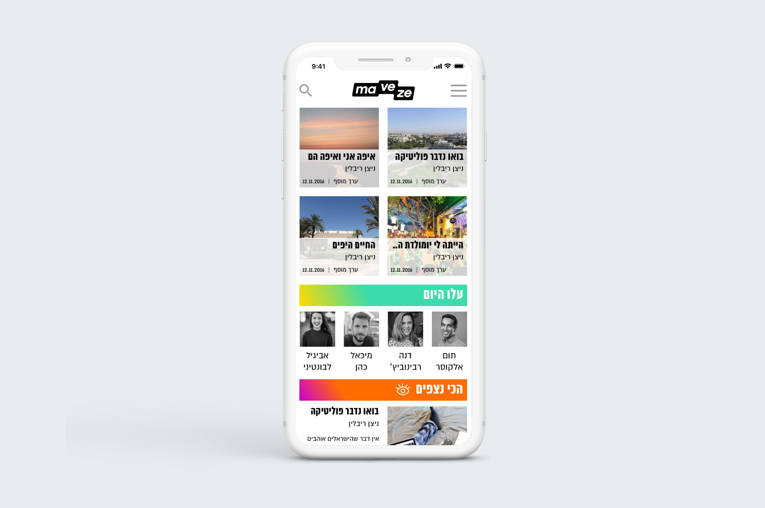
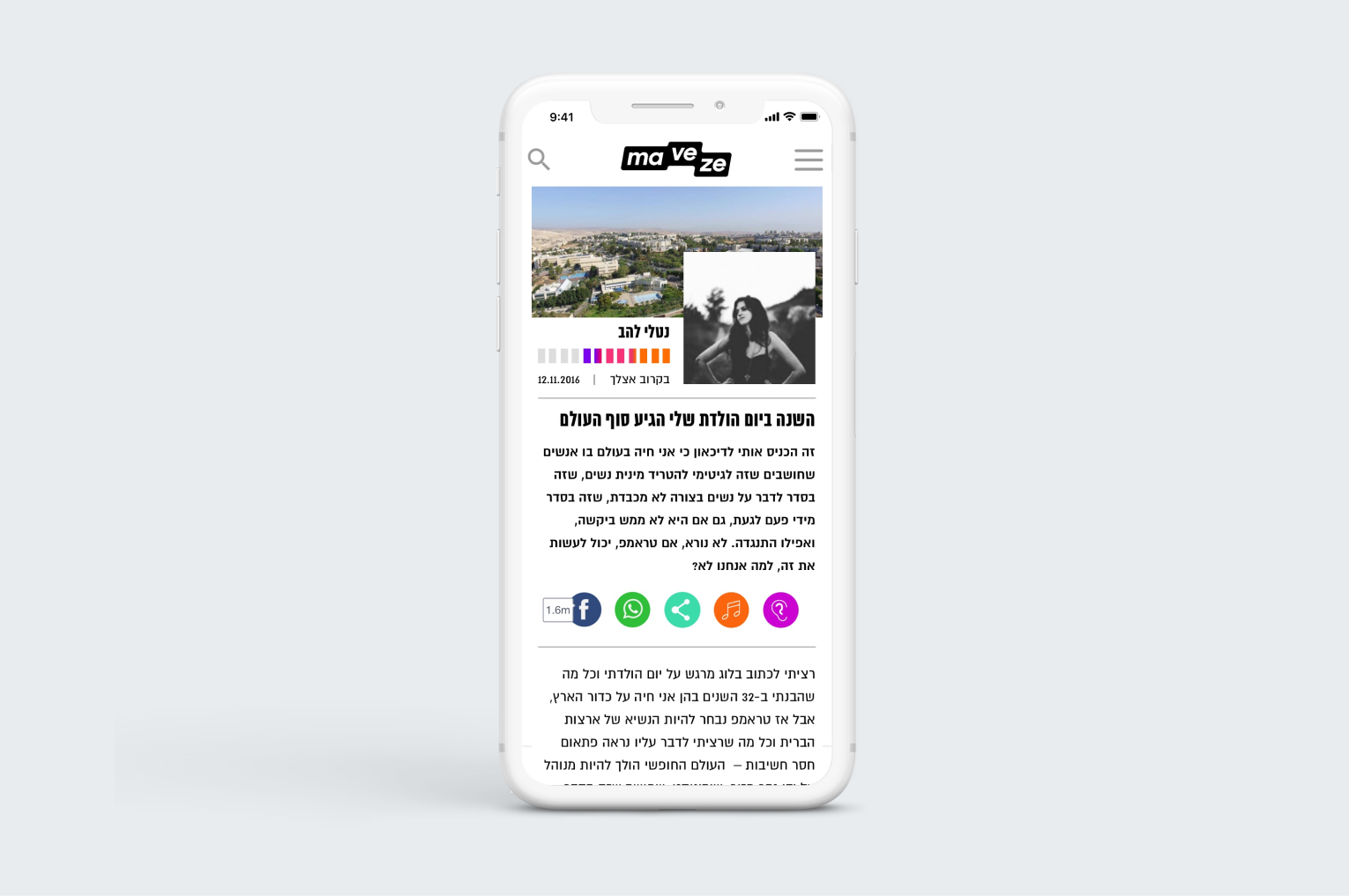
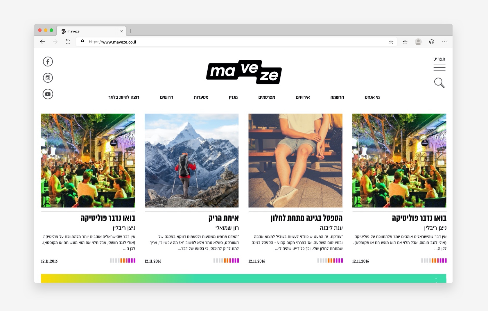
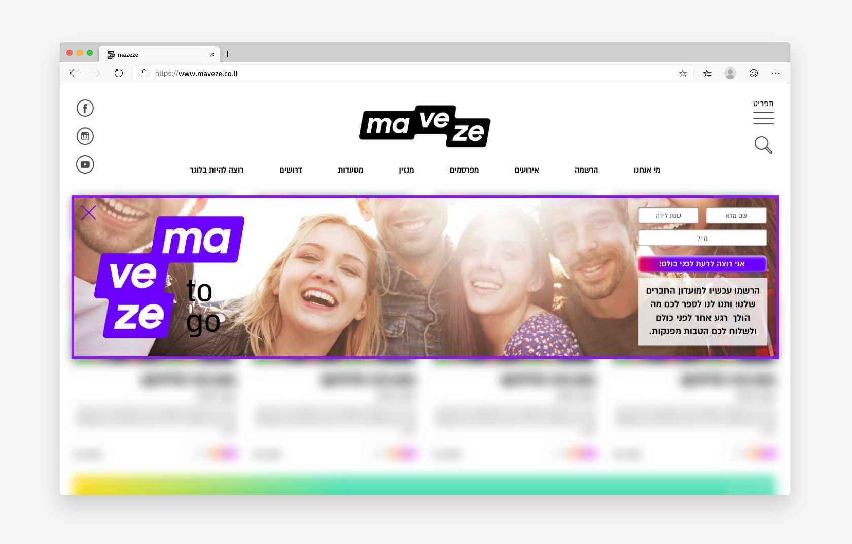
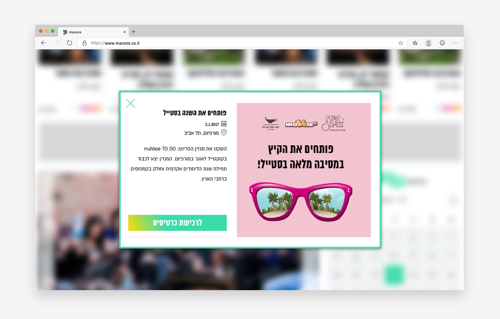
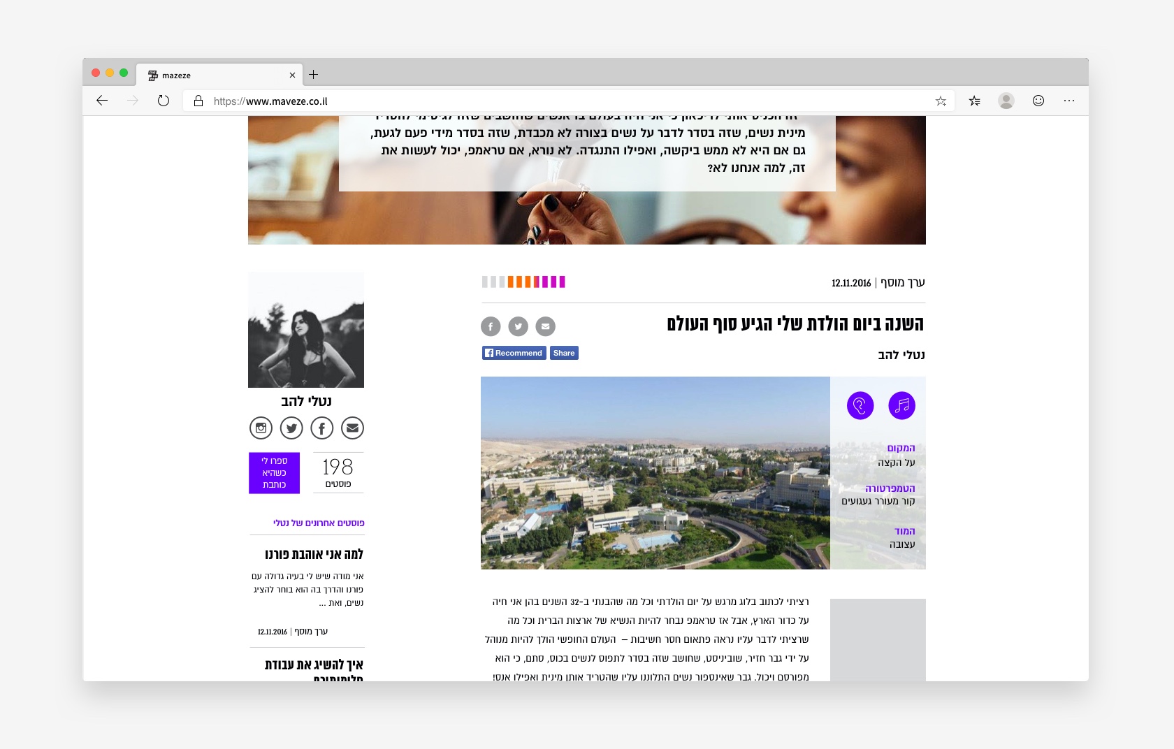
The content on “maveze” is created by different bloggers as personal or sponsored posts and is divided into categories; such as work, study, culture, sports, entertainment, dating and politics and society. The redesigning was inspired by top news and content sites.
In this project, the main design goals were to make the interface attractive and friendly with an innovative UX/UI.
I approached it by︎︎︎ increasing the breathing space in the design, simplifying the site navigation and get a better flow. It was important to combine sponsored and original content in a seamless way. The new design was also to launch the brand’s new look and integrate metrics of news sites with bloggers' content.
UX Design
UI Design
Visual Design